

Moodboarding Toronto: Crafting Brand Aesthetics That Resonate Locally
Posted on Friday June 20, 2025
Each neighbourhood carries its own personality, and when we build visual identities for brands, we start right there: with community. Whether it’s real estate development, retail brand, or local restaurants, great design begins with the feeling of the street it lives on.
Start with Neighbourhood Identity
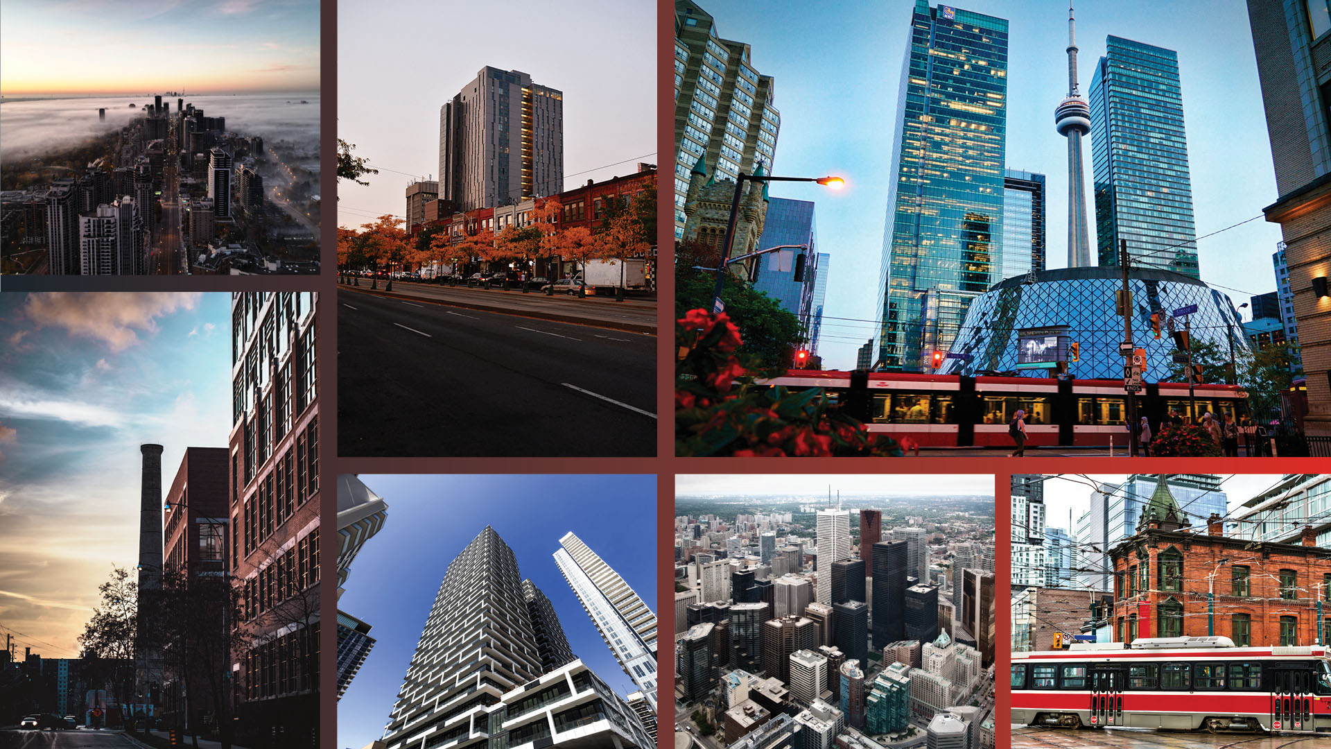
Toronto isn’t just one city, it’s an exquisite patchwork of stories, moods, and microcultures. Each neighbourhood offers a distinct identity unique to the location, architecture and its residents, from laid back beach vibes to glass and steel ambition. When we design a brand, we ask: What does this place feel like? Who lives, shops, works and walks here? What textures, colours, and shapes define the area, naturally and culturally?
Here we break down the vibes of some central Toronto neighbourhoods as examples:
Beaches / Queen East
- Mood: Relaxed, nostalgic, community first
- Visual Palette: Soft neutrals, oceanic blues, sandy beiges
- Details: Casual warmth, charming boutiques, cozy coffee shops
Liberty Village
- Mood: Industrial ambition meets creative energy
- Visual Palette: Concrete textures, bold sans serif fonts, metallics
- Details: Loft style workspaces, production houses, entertainment hubs
The Annex
- Mood: Academic meets heritage
- Visual Palette: Deep greens, warm wood, brick red
- Details: Victorian homes, bookstores, university cafés, serif typography
North York
- Mood: Retro modern, tidy and utilitarian
- Visual Palette: 80s brick, greys, browns, punchy accents
- Details: Uniform structures, civic buildings, Mel Lastman Square
Midtown (Yonge & Eglinton)
- Mood: In-progress elegance
- Visual Palette: Soft steel, glass blues, construction neutrals
- Details: Growing skyline, transit nodes, polished ambition
Downtown Core
- Mood: Futuristic, fast-paced, high-energy
- Visual Palette: Reflective silvers, dark charcoals, electric neons
- Details: LED lights, mirrored towers, CN Tower, city at night vibes
Inspired by the Urban Fabric
We believe the best brand design feels rooted in its environment, not dropped in from somewhere else. That’s why our creative process always includes deep immersion in the local visual language.
We source inspiration from:
- Historic architecture and facades
- TTC transit signage and wayfinding systems
- Public art and murals
- Neighbourhood cafés, weekend markets, and storefronts
This process isn’t just aesthetic, it’s strategic. It allows us to create brands that are truly emotionally aligned with the local audience, telling lifestyle stories that resonate on the street level. It’s important to share a collective identity and yet revel in the unique attributes each area brings to life. Head and heart marketing is the golden key to it all.
Designing for Lifestyle: Branding Tips for Real Estate & Retail
Whether you’re branding a corporate entity, a one of a kind luxury residence, a new condo build or a boutique concept, here’s how to bring neighbourhood into your narrative:
- Start with a moodboard, not a logo. Pull photos from the area, textures from the buildings, and tones from the local environment. Get to really know and appreciate the unique selling prospects of the community.
- Use typography that reflects place. A classic serif might evoke heritage, while a minimal sans-serif speaks to urban sleekness.
- Choose colours that aren’t just trendy, they’re contextual. What’s already working visually in the area? What emotions do those colours evoke? Consider contrast and cohesion.
In a city as complex as ours, the most powerful branding doesn’t just stand out, it fits in, thoughtfully. When done right, it feels like it’s always belonged here.
Need help moodboarding your next project? Let’s talk.
We specialize in turning neighbourhood character into creative gold.
ALL POSTS