

AODA/WCAG Spells Accessibility
Posted on Friday November 28, 2025

When it comes to making websites and digital spaces accessible to everyone, the WCAG and the AODA, the laws that require their implementation, guide the way. Everything from colour contrast to font size is considered. More than just a jumble of letters, here’s a look at where they came from and why they matter for your website.
The Who, What and Where
The WCAG (Web Content Accessibility Guidelines) are a set of international standards created by the World Wide Web Consortium (W3C). These guidelines outline how to make web content more accessible to people with visual, hearing, physical, or cognitive disabilities.
The Accessibility for Ontarians with Disabilities Act (AODA) is a law passed in 2005 by the Ontario government with a goal to make Ontario fully accessible by 2025. The AODA sets standards for accessibility in different areas – like customer service, employment, transportation, as well information and communications, which includes websites. Under the AODA, organizations must follow ensure their websites meet WCAG 2.0 Level AA rules to make their digital content easier for people with disabilities to use. These rules include things like placing alt text on images, ensuring sites are screen-reader friendly, and that they’re optimized for keyboard navigation.
The guiding principles for the WCAG continue to evolve from their inception in 1999 to their most recent version which was released in 2023. Each version builds on the last, adding more ways to ensure the web is inclusive for everyone. In Europe, the European Accessibility Act (EAA) references a more recent version of WCAG, requiring websites match WCAG 2.1 Level AA. Recent reviews of the AODA have also recommended updating the version of the WCAG required to 2.2.
Commonly Broken WCAG 2.0 Rules
Here are a few of the most common WCAG 2.0 Level AA failures that we have seen while auditing websites for accessibility issues:
1.4.3 Contrast (Minimum)
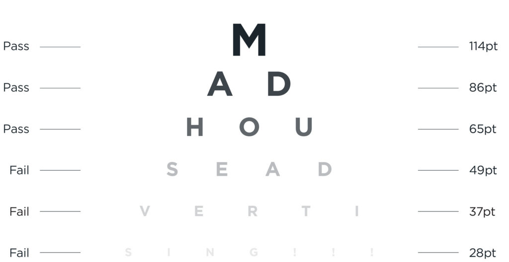
Colour contrast is the difference in brightness between a foreground and background colour. The higher the contrast text has, the easier it is for people to read. For example, yellow text on a white background has a contrast ratio of 1.07:1 whereas black text on a white background has 21:1 (the largest possible contrast ratio). The WCAG recommend that text must have a minimum contrast of 4.5:1 and large-scale text (minimum 18 point or 14 point bold font) must have a minimum contrast of 3:1.
1.1.1 Non-text Content
Screen readers cannot see that an image on a website is of a dog or the button is for search represented by a magnifying glass icon. The non-text content rule requires that text alternatives are provided for non-text content. Images must have alt text provided if they are used for non-decorative purposed and buttons or links without text must have an aria-label attribute for screen readers to inform users of what the element does.
1.3.1 Info and Relationship and 2.4.6 Headings and Labels
Headings help structure and give a visual hierarchy to the content on a page. When a page heading is coded with a paragraph or div tag instead of a heading tag, screen readers cannot recognize it as a heading and will treat it as normal text. Heading tags provide semantic information that screen readers rely on, rather than the visual cues that some users might not be able to see.
The W3C publishes full set of requirements outlined in the WCAG on their website, along with techniques to ensure compliance and failures to avoid.
Improve your reach and your karma
The AODA and WCAG guidelines were put in place to allow for people with various ailments and disabilities to function within our digital world. This extends to those living with visual disabilities, hearing impairments, mobility limitations, cognitive or learning disabilities, injury and even aging. Having your brand reach more audiences is always a top priority so falling in line with these online standards should be a no-brainer. Some of these guidelines, like image alt text and the proper use of headings, can help improve a site’s SEO, once again extending the reach of your organization’s website. Beyond simply assisting those living with disabilities, WCAG standards can be beneficial for mobile users, users with slow connections, seniors or people who may be in a low-light or noisy environment. It’s important to remember that accessibility doesn’t just apply to those with disabilities, and that greater accessibility leads to a great user experience for all.
By including accessibility as a focus from the get-go means preventing potentially expensive retrofits later. Accessible sites are clearer, faster and easier to navigate – leading to more conversions, longer time spent on a page and more form completions. By designing digital spaces that work for everyone, we build a better, more equal online world.
Why risk it?
As mentioned, the AODA is a law in Ontario, so what are the repercussions for non-compliance? Beyond the horrible PR? Up to $100,000 per day for corporations or $50,000 per day for individuals or unincorporated businesses! Directors and officers could face liability suits, and it could significantly affect relationships with partners and alienate clients. The loss of profits, reputation and clients goes against all the teachings of Business 101. By complying with the AODA and WCAG just makes sense. Questioning the accessibility of your website? Contact us today.
ALL POSTS