

Seeing Red? Breaking down colour theory in selecting brand colours
Posted on Thursday October 30, 2025
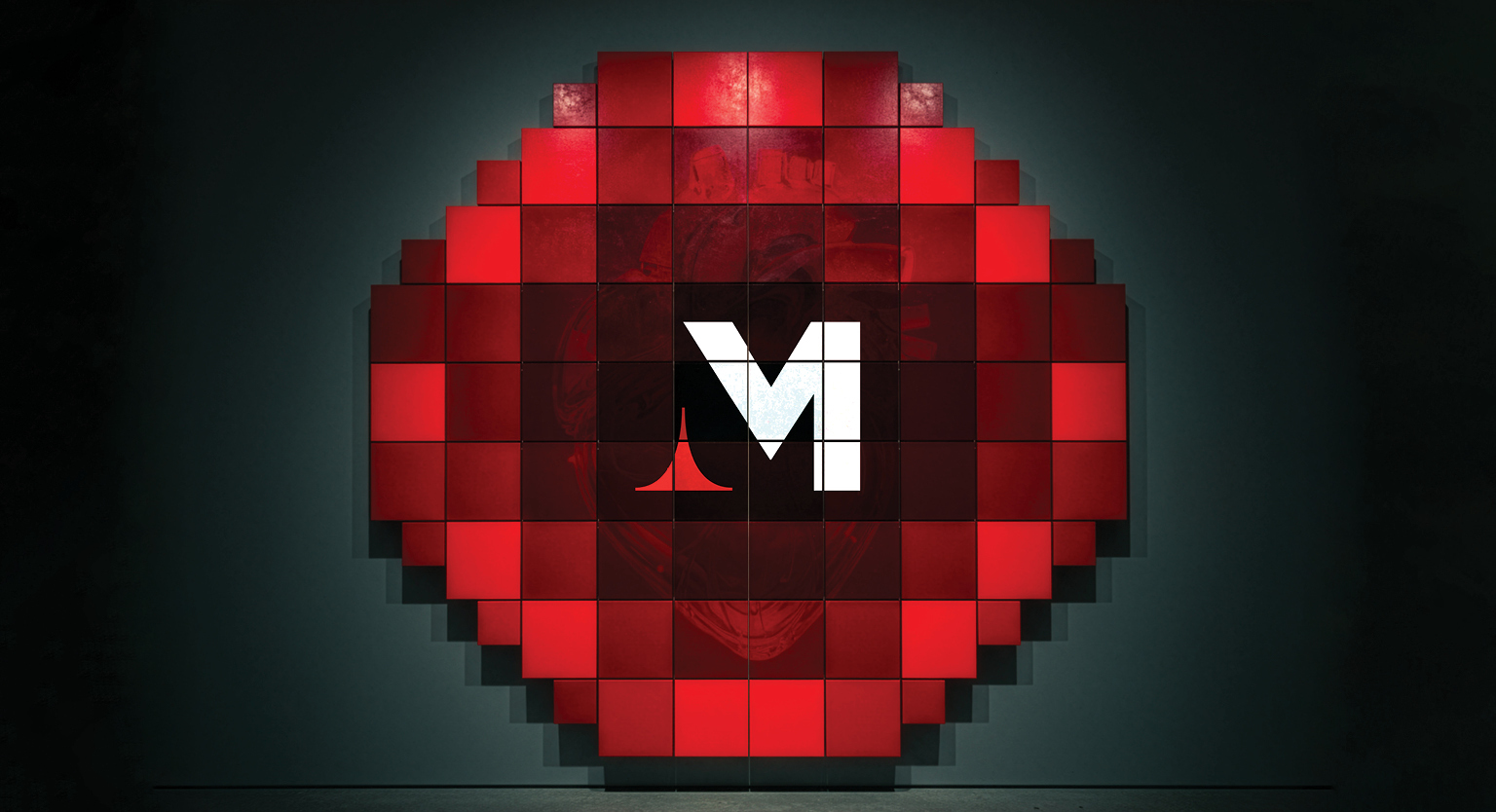
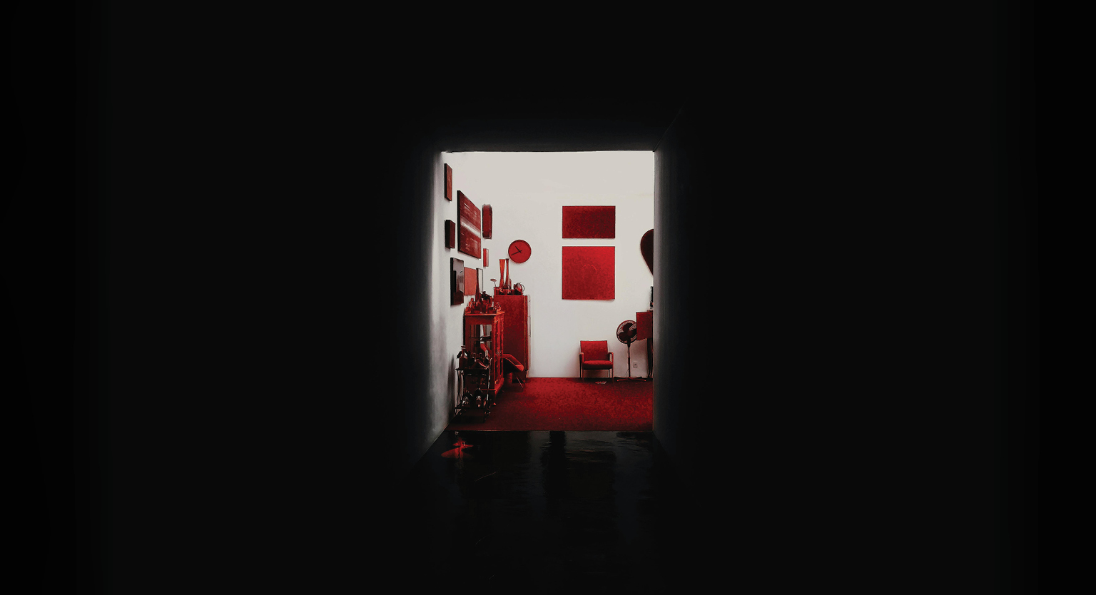
At Madhouse everything we do is marked by research and intention. Every creative decision has meaning behind it – especially colour. This was no more apparent than when it came time to defining our own visual identity: Madhouse Red.
As a marketing agency, this sizzling scarlet is more than just a hex code for our logo; it’s a statement. It’s the pulse of our brand – the colour of energy, confidence, and fiery creativity. It’s bold, dramatic, and sets our brand apart from a sea of generic brand neutrals.
In a peek inside the Madhouse, we break down the colour study and selection process we undertook more than 22 years ago to build our brand – a process we undertake for every single one of our projects and clients to this day.
The Strategy
At the beginning of any project, we begin by understanding the product, the client and the purpose. This process was just as significant when defining ourselves as it is for any piece we work on. Who is the brand? What is its purpose? Who is the audience? What are they trying to say? When you start to answer these questions, a feeling builds, and choices become clear. At Madhouse, we don’t believe in playing it safe. We believe in making an impact, in stirring reactions, in building campaigns that make people stop and feel. For us, a cool blue or calming green wasn’t in the cards. We wanted fire and action and for that we needed an iconic red. Madhouse Red.

The Significance
Red is one of the most powerful colours on the colour spectrum. It grabs attention, evokes emotion, and creates a sense of urgency – qualities that perfectly align with our goals as an advertising agency.
Culturally, red is consistently significant as a symbol of luck, sacred power, strength, celebration and success. In numerous Asian cultures, red is included in major cultural ceremonies as a symbol of joy and prosperity. In Middle Eastern, African and some Slavic and European cultures, red is a symbol of protection, health and vitality. The choice of red wasn’t just about aesthetics, but also connection. We wanted a colour that not only represented who we are internally but also resonated with our clients and audiences. Whether we’re designing a digital campaign, producing a video, or crafting our social media feed, “Madhouse Red” ties it all together, like a unifying thread through every expression of our brand, harnessing the cultural power of this colour.
The Science
Psychologically, red has always been associated with passion, excitement, and drive. In branding, it’s known to boost visibility and trigger faster decision making. In classical art history, red or “warm” tones always draw the eye in first. That’s exactly what “Madhouse Red” does. It speaks to the fire that fuels our ideas and the drive that keeps our team pushing creative boundaries. In every logo, headline, and campaign backdrop, this red helps act as a visual exclamation point – a symbol of energy, strength and trust.
Studies have shown that up to 90% of snap judgments about products and brands can be based on colour alone. The right palette can enhance brand recall, influence consumer behaviour, and even affect how messages are perceived. Throughout our work, we dig deep into the many meanings behind the colours we select for our clients, weighing factors like psychological resonance with cultural significance, audience demographics, location, and intention.
The Statement
“Madhouse Red” was chosen not just for its vibrancy, but for its intensity. It’s a deeper, modern red – rich, confident, and sophisticated – representing the balance we bring to every project: bold ideas grounded in strategy. It’s the red of theatre curtains, creative sparks, and ambition. Red is human – it’s the colour of conversation, emotion, and movement. It’s the colour of rebellion, of rock and roll, and daring to go beyond what’s expected to achieve what’s needed. It’s the mark we leave on our work as a symbol of our experience, expertise and standards. It’s the statement of trust that clients count on. Nothing leaves our studio without meticulous consideration and the confidence and sign off of our team. And at Madhouse, we love to make a statement.
Want to make a statement of your own? Let’s talk.
ALL POSTS